Tuesday 24 December 2013

01 Jerry Ordway | Top 10 Favourite Huntress Artists

Now that we've spent the last week discussing some of the fabulous talent in the industry, we now get to my #1 favourite Huntress artist of all time. Some have probably wondered why Joe Staton isn't holding the #1 spot on this list, and it is a legitimate question given his own history with the character. After all, he is the man who designed, formalised, and established the look of the character in both of her incarnations. He was even active in developing both versions very early on in their publication histories. But as a comic book fan, as a fan of a particular character, and especially as an artist myself, this list has been more personal to me than most 'top ten' lists that get made. In particular, this exercise has been about the artists who have been the most influential to me.

As someone who no longer gets to draw as much as I used to because of the work that I do, I'm always looking for new ways to improve and often take to other artists for inspiration. Specifically, I tend observe the way other artists handle anatomy (yes, there is a reason I focused on it so much in the previous posts), and I tend to favour ones who have a thorough understanding of how the human body looks and functions. When an artist of this calibre ends up drawing a character I like, I notice them right away and spend a great deal of time observing every detail of their work. I've even spent hundreds in the past buying the original pages from them to get a closer look of the work that they did. All of this factored into the artist I chose as my #1: Jerry Ordway.

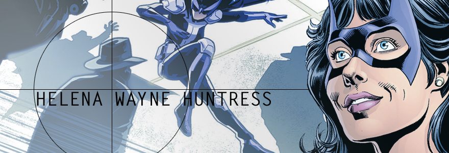
In many ways, Ordway has been more than just the man who introduced me to the comic book version of the Huntress, specifically the Helena Wayne Huntress. He was the second American mainstream artist since Terry Dodson to inspire me to start drawing again. For a little bit of background, I have been drawing ever since I was three, and most of my life I've experimented with different drawing styles as a way of improving already existing skills. You can basically say I am self-taught. Prior to becoming a science major, I was originally going to school to become a professional artist. Biggest mistake of my life. Not only did I not like having art teachers tell me that my style was wrong because it wasn't up to their standards, but I especially did not like them telling me how to do something I've already been doing most of my life. Worse yet for me were the deadlines and the long hours I spent doing the work, which often hampered my creativity. After a while I could no longer put forth my best work, and I burnt myself out on the one thing I enjoyed most to the point where I called it quits. I changed my major and pretty much retired my pencil and sketchbook for a long, long time. Then I read the JSA Annual from 2008, and I fell in love with wanting to draw again.

One of the first things I noticed about Ordway's drawing style right away is how very detail-oriented he is. It's not just the way he draws human bodies (which I've primarily focused on in these posts) but there's even a life-like quality to the way he draws the cityscape. His Gotham City, for example, has a very New York feel to it and does not at all possess any of the gothic architecture of the mainstream version, except for a few gargoyle statues. His version of Gotham looks a lot less grimy and feels a lot cleaner, which in a way, makes it feel less dangerous. He's also very detailed in the way that he draws the skyscrapers, which actually reminds me a lot of George Pérez since he also draws very detail cityscapes.

On the front of drawing characters, if there are two words to describe it, it is 'absolute perfection.' I can't tell you how awe-inspired I was to see how realistic his characters looked from the way that their bodies were drawn, right to their body language and facial expressions. He really does excel at drawing life-like people who look real and express real human emotion. That to me is a really big deal because it truly does help to suck me into the story that's being told, and even moreso when there is a very strong script. All of this was evident in the way he drew the JSA Annual and its two main characters of Huntress and Power Girl.

Before we get into the details, it is worth noting that like George Pérez and Joe Staton, Ordway also has a long history with both of these characters. He drew the very first incarnations of Huntress and Power Girl in the pre-Crisis continuity and he drew them again for the post-Crisis continuity when the parallel world of Earth-2 was reinstated. It is also important to note that given the very different tones of these two eras of comics, he didn't draw these two characters the same way in the post-Crisis continuity as he did pre-Crisis. An excellent case in point is the way he drew the Helena Wayne character between these two continuities.

In her original incarnation, Ordway drew Helena as someone who is very compassionate, reasonable, and confident in her work. She was often drawn as serious and mature, and she was also very calm and collected. The post-Crisis version of her, however, was a lot more shaken-up. In huge contrast with the way she was previously drawn, the post-Crisis Helena Wayne was depicted as angrier, more withdrawn, and a lot less trusting of others. In terms of characterisation, she very much resembled the post-Crisis Batman if he was a woman. The only difference here is that Helena was at least willing to kill the Joker if meant saving the lives of the people around her (and many more) whereas the mainstream Batman would never think of crossing that line.

In terms of anatomy, Ordway's handling of Helena's body has been very consistent between the pre and post-Crisis continuities. Obviously his art style has improved since 1984, the overall look of the character has stayed the same. His Helena Wayne has a very anglo-saxon look to her and she has a very natural looking body for a young woman in her late 20s, possibly early 30s by the time she appeared in the JSA Annual. One noticeable difference, however, between the two continuities is that the post-Crisis Helena has more of a build to her whereas the pre-Crisis one had less muscle tone. This was also noticeable with Power Girl as well who was skinnier and less busty in the pre-Crisis continuity than how she was depicted post-Crisis.

In the New 52, Ordway almost had the chance to draw Helena Wayne again when he was assigned to draw eight pages of Worlds' Finest #5. I'll be honest and say it was a huge let-down that Ordway wasn't given all of the flashback pages to draw, especially since José Luis García-López ended up backing out of drawing his sequence (in this case, the Huntress sequence). While I don't think Wes Craig is a bad artist, his art style is also drastically different from that Perez, Ordway, and García-López, which really stood out. But what was most disappointing to me is that we didn't get see how he would have drawn the New 52 version of the Huntress who is wildly different from her previous incarnations.

Since Ordway is the man who (for me) best captured the Helena Wayne version of the Huntress in both of her previous incarnations, I am still very curious to see how much different or similar he would draw this same character in a newer continuity. The closest we got to seeing his version of her was in a sketch that he drew for the Worlds' Finest #5 cover, but a final version of that never saw the light of day. I do hope he eventually gets the chance to draw her in the New 52 with the current costume, otherwise I may have to shell out a good several hundred for a commission. :P

Well fellow readers, this is it! The conclusion of my top ten favourite Huntress artists of all time. I have to admit, most of these were very difficult to write because I never know how to begin a discussion on very talented people. But I nevertheless found this writing exercise very rewarding, and this last entry was particularly special to me.

At this point, it's time to grab a sketchbook and start drawing now that I have some free time before I have to start going back to work next week. :)

That being said, I hope everyone has a very happy holiday season, and I'll have another post up soon just before the year ends, and the new year greets us. Stay tuned! :)

Monday 23 December 2013

02 Marcus To | Top 10 Favourite Huntress Artists

Undoubtedly one of the best talents to surface in recent times, Canada's very own Marcus To is a well known name in DC Comics fandom for his work on Red Robin, and more recently the Huntress miniseries, Batwing, and Cyborg 009.

Admittedly, To was off to a very bad start with the Huntress, not because of any creative decisions he made as an artist being tasked with reintroducing the character in the New 52, but because of the uneven ground that exists between the character's staunchly devoted fanbase and DC Comics' own treatment of the character.

To be very specific, there is a tendency on DC's part to subject the Huntress to drastic origin changes following a major continuity-shifting reboot. Worse yet, they even have a history of deceiving fans of one particular version of the character into buying a book that features a character that looks like the one they want to read about, but isn't. This first happened in 1989 when fans of the original pre-Crisis Helena Wayne character bought the first iteration of a Huntress solo series expecting to see their beloved character again, only to quickly learn that the Huntress fronting that book was a new character named Helena Bertinelli. The same thing happened again in 2011 when DC Comics reintroduced the character via another Huntress series, only this time DC Comics delayed explicitly outing the real identity of the Huntress until they felt the timing was right.

As you can imagine, both incidents have led to massive shake-ups within the fandom to point where there is considerable division between fans of both Helena Wayne and Helena Bertinelli in the year 2013. Given all that was put on the plate there, I can't that I envied Marcus To's position as the guy who had to deal with the constant fandom bullshit despite just doing his job. Nevertheless, To did remarkable work on a character that started off as Helena Bertinelli and was eventually revealed to be Helena Wayne of Earth-2. So remarkable was his work on the Huntress miniseries that it landed him the #2 spot on this list.

Let's start with the first thing I noticed about To right away: he had a ridiculously good handle on the character despite being (initially) in the dark himself over whether the Huntress he was drawing was Helena Wayne or Helena Bertinelli. One of the things I noticed immediately from the first issue was that the Huntress looked a lot like Helena Bertinelli in appearance but possessed the personality traits of the original Helena Wayne character. The fact that he was able to capture the distinct traits of two characters into one person was in itself pretty fascinating. Though at the time, I was more fascinated by the revelation that this was supposed to be the Earth-2 Helena Wayne, a character I recalled being a lot more merciful than this current version, which gets me to my next topic:

His Helena Wayne is layered, but she is also cunning and brutal in her methods. When she is alone and the Huntress mask is off, she is often shown to be very pensive and at times demonstrates thoughts that border on sociopathic. When she is around other people, she presents herself with a charming personality, she's flirty, and is even idiosyncratic in her behaviour. But once the Huntress mask comes back on, her personality transforms to that of a relentless crime-fighter who harbours no sympathy for sex traffickers and is very casual in the way that she hurts and even kills them. Long story short, this is a Helena Wayne who doesn't give a shit for established law and will enforce her own version of it as she sees fit. This is obviously a very huge change from the previous version of her, enough to possibly even horrify the pre-Crisis Helena Wayne if she was see to how her own future turned out. But the bottom line here is that To never misses a single character beat with her, and nails each one flawlessly.

On the front of art style, To also has a very clean and crisp look to his pencil work. Like many of the previous artists discussed, he has a very good sense of lighting and knows when to use shadow and when not to use it. As such, he doesn't overdo it on the line work and maintains a very good balance between light and dark. He adds shadows where needed, but leaves enough room for the colourist to fill in the rest of the details that a scene requires without making the images look too heavy.

On anatomy, To definitely strives for anatomical correctness but doesn't go for the same level of perfection that some of the previously discussed artists strive for. This isn't a bad thing of course, and it does add to the unique look of his art style. His human bodies look natural and don't look too ripped or exaggerated in anyway. On that note, he also doesn't sexualise the female body to appeal to the male gaze and always treats his female characters with respect. His Huntress is always drawn with a natural athletic-looking body for a young woman who is physically active and is never drawn in any cheesecake poses. This is true even in the scene where she beats a pimp unconscious in her lingerie in the first issue of her miniseries. Occasionally he'll give the reader a glimpse at Helena's butt and only once did he actively draw a butt shot of her, but for the most part, To is respectful of her character and doesn't try to sexually arouse the reader with her posing, which is always great to see.

All in all, the Huntress miniseries continues to be my favourite Huntress story of the New 52 so far, and that is in part due to To's fabulous artwork on the book. Even though he's over at Marvel right now, I do hope he gets more opportunities to draw the Huntress (and Power Girl) in the future. I think out of my top five, he's definitely an artist I would like to see again!

Tomorrow....we finally get to discuss my number #1 favourite Huntress artist of all time. He or she may or may not be who you expected to be.

Stay tuned! ;)

Sunday 22 December 2013

03 Emanuela Lupacchino | Top 10 Favourite Huntress Artists

If there is one artist who has drawn the Huntress in the New 52 that I wish would've continued drawing her, it is Italian artist Emanuela Lupacchino. Residing in the capital city of Rome, Lupacchino has been making a name for herself in the comics community for her various works at Marvel, DC Comics, IDW, and more recently, Valiant.

While Lupacchino has regrettably been relegated to cover artist for various DC works, she did get the chance to draw the Huntress for one full issue of Worlds' Finest, (issue #15 to be exact), and 'breathtaking' doesn't even begin to describe the impression it left on me. To fully understand the extent with which her work left me feeling awe-inspired, let's start with the first thing her artwork reminded me of: Terry Dodson.

Anyone who has interacted with me or known me long enough knows how much I love Terry Dodson's work. He was the first American mainstream artist I became familiar with after picking up the first twenty issues of Harley Quinn Vol. 1, and his drawing style was one that had the most influence on me as an aspiring artist. Taking into account how much Dodson's work contributed to my developing my own art style  growing up, it should come as no surprise that I immediately gravitated towards Lupacchino's work when I first encountered it and noticed similarities.

In terms of style, Lupacchino has a very clean and crisp look to her pencil work. Her contours are very fine, solid, and smooth, and she doesn't oversaturate the page with line to give the perception of depth. This is one way that her work reminds me of Dodson. She also has a very good sense of lighting and knows when and where to place shadow, which admittedly is something I've always struggled to get right. In the same way that her contours tend to be very fine, solid, and smooth, her shadows are exactly the same way. There are never any rough edges to her shadows, and if any additional lighting and shadowing needs to be done to fully capture the feel of the piece, she leaves that to the colourist. And of course, under the right colourist, her work really stands out even more.

When dealing with human anatomy, Lupacchino is also something of a perfectionist. I often observe that some artists tend to take 'shortcuts' with anatomy, particularly in very complicated scenes. Lupacchino, however, never takes any shortcuts with anatomy and she makes sure that every single body part--from each individual digit right down to a single lock of hair--looks right. If there are five fingers on each hand and five toes on each foot, she will draw every single one. She will not draw 'bundles' that give the illusion of fingers present, she will outright draw them. On drawing muscle, Lupacchino also demonstrates a thorough understanding of skeletomuscular physiology, and as such, her muscles tend to look very natural on page. She doesn't exaggerate their appearance to give her characters the standard 'body builder' look that is often given to male superheroes in the industry. On posing, Lupacchino admittedly draws her fair share of cheesecake and has been known to even sexualise the female body in ways that draw your eyes to their breasts and butt. Yet, despite this, Lupacchino also avoids posing her characters in back-breaking poses that could not be achieved by even the most flexible person on the planet.

When dealing with faces (and more specifically facial expression) Lupacchino excels at capturing emotion and is quite versatile at it. If her character is feeling confident and fierce, both of those emotions will reflect on the character's face. If that character is also feeling sad and lonely, it will show in a way that differs from depressed and mourning. On drawing facial features, this is yet another way Lupacchino's style reminds me of Dodson's, particularly in the way that she draws eyes, eyebrows, the nose, and even the shape of a character's face. There is a simplicity to the way she draws each of these things while keeping them expressive and life-like. Once again, she doesn't overdo it on the line work and if any additional details need to be filled in to capture the character's full expression, she leaves that to the colourist.

Now that we've spent a considerable number of paragraphs discussing her art style, let's now talk about how well Lupacchino captured the essence of the Huntress. I'd honestly go as far as to say she was one of the very, very few artists in the New 52 who has successfully captured Helena Wayne's, personality, attitude, and body language in full. Admittedly, Lupacchino's Helena Wayne looks very Helena Bertinelli in her appearance (namely in that she's drawn in a way that screams 'fiery Italian' to me), but there's also whole lot of Selina Kyle in there as well, which is very believable for a woman who is her daughter to begin with. Like Selina, Lupacchino's Helena is fierce and carries herself with a fearless demeanour that embodies a very bold confidence. She embodies the kind of confidence that says 'this is someone who's been through a lot in her life and doesn't expect any surprises,' but is also not the type to go down without putting up a fight. She also successfully captures Helena's playfulness in her facial expression and body langauge, which is just as equally important because despite her rather dickish behaviour most of the time, Helena is in fact very playful and loves to mess around. When drawing her action sequences, Lupacchino also successfully captures her momentum and energy, and is often presented as very agile, flexible, and rough which works for a character that was raised to be a fighter all her life.

All in all,  Worlds' Finest #15 was a pretty rewarding experience for Lupacchino's art alone, and it definitely left me desiring more. I actually found myself wondering why she didn't continue drawing the book after that issue, especially since I felt her style was a perfect match for both the Huntress and Power Girl. While it saddens me that Lupacchino is back to being cover artist again and has since moved on to other projects (including the Superman: Lois Lane one-shot that I'm planning on getting in February), I do hope that this won't be the last we see of her! She's awesome!

Tomorrow: Marcus To!

Saturday 21 December 2013

04 Nicola Scott | Top 10 Favourite Huntress Artists

Hailing from Sydney, Australia, Nicola Scott is a fan favourite artist famous for her work on Birds of Prey, Secret Six, and currently Earth-2 for DC Comics.

Like DC legend, George Pérez, there are three things that stand out to me right away about Nicola Scott: DETAILS, DETAILS, DETAILS! To make a case about how detailed Scott is with her art, even when she draws a single character on a blank page, she doesn't leave out a single hair, let alone a single muscle and strives for anatomic perfection. You read that correctly. She doesn't strive for having correct anatomy, she takes it a step further: she literally strives to make the human body look perfect in a way that makes me think of Greek and Roman sculptures from times long past. This is most evident in the way that she draws men who are always bulking with muscle, they all have a six or eight pack, and Scott especially never leaves out the bulge if they are wearing skin-tight leather or spandex.

In addition to drawing some very gorgeous looking lads with perfect hair and nicely padded gluts, Scott also draws her women with athletic bodies. In huge contrast with the industry standard of making comic book women look either like supermodels or porn stars, Scott combats this standard by presenting her women with the same idealised bodies that are often reserved for male superheroes. They may not pack the same amount of muscle mass as their male counterparts, but the women are nevertheless presented with bodies that are feasible for women who engage in physical combat and perform manoeuvres that require a considerable amount of strength. On a similar note, Scott is also famous for reversing the use of cheesecake in order to appeal to the female gaze. In the same way that male artists often draw female superheroes in poses that often place focus on their more sexual parts (that is their breasts, butts, and vulvae), Scott herself applies those same kinds of poses to the men that she draws and often poses her women in the same kinds of majestic poses that are often reserved for men. For excellent cases in point, look no further than her work on Secret Six and Earth-2.

When it comes to drawing the Huntress, Scott has a considerably long history with the character. She has mostly drawn the Helena Bertinelli version of the character in both Birds of Prey and Secret Six, but she also got the draw the Helena Wayne version (as Robin) in the pages of Earth-2 #1. While it is unfortunate that it was decided at both the management and creative levels to inexplicably remove the Huntress from her native world of Earth-2 (or she would still be drawn by Scott), she has nevertheless seen great treatment under Scott's pencil. In the few panels that she got to draw the young Helena, we saw how confident and happy this teenage girl was to be able to work alongside her father before abruptly losing him from her life. In the scene where Bruce began to say his goodbyes to his young daughter upon realising (in advance) that he wasn't going to make it out of the Apokolips War alive, we saw how quickly Helena went from being the enthusiastic assistant to her superhero parent to a very scared child about to lose her father. In just three panels, Scott successfully captured Helena's emotional vulnerability and sorrow to the point where even those panels brought me to tears in a story I didn't even like.

Again the loss of Helena Wayne from Earth-2 is something I've strongly lamented in part because her removal did not help her narrative or character in any meaningful way, and also because Nicola Scott hasn't drawn her since. Drawing from her past experience with Helena Bertinelli (who in my opinion was characterised very similarly to the pre-Crisis Helena Wayne in Birds of Prey), I have no doubt that Scott would have continued to do her justice should she have been allowed to continue to draw her. In the same way that Scott was able to capture the emotional vulnerability of a child losing a parent, she could have similarly captured the fierceness and anger of a young woman who no longer feels like she has anything else left to lose in a world that's been broken beyond repair. She could've also easily captured Wayne's idiosyncratic behaviour and charming personality (when she's not being a dick to anyone that is), given her versatility and attention to detail.

It is of course still possible for Nicola Scott to draw this version of Huntress (and Power Girl) again in the future if returning to Earth-2 is in the cards for this character, and if Scott plans on staying on the Earth-2 title for a lengthy period of time. Since the Worlds' Finest characters are already set to appear in a crossover with Batman/Superman starting next month, the possibility for an Earth-2 crossover is starting to look very likely. Given the tease that we got with the latest solicit for Worlds' Finest #21, I wouldn't be surprised if we start seeing them on future solicitations for Earth-2.

Tomorrow: Emanuela Lupacchino!

Friday 20 December 2013

05 Amanda Conner | Top 10 Favourite Huntress Artists

While she is most accurately described as 'The Best Power Girl Artist' DC Comics has seen, Amanda Conner did have a very good handle on her best friend as well, even if she was just a hallucination pulled out of Power Girl's memory by Psycho-Pirate.

In something of a departure from the artists we've discussed so far, Amanda Conner has a considerably more cartoony art style that brings a different kind of energy and momentum into the characters she draws. As such, the motion in her action sequences tends to appear more fluid and a lot less static, which helps to make the imagery feel more lively and engaging to me as a reader. A lot times (to me anyway) I don't feel like I'm reading a comic book but an animated series.

Another thing that stands out to be about Conner's art is her perfect balance between her use of expressive body language while keeping the characters anatomically correct. A lot of times her characters will display very explicit emotions but at the same time she doesn't exaggerate their facial features to get the point across. Similarly, her characters' body language will complement what they're feeling as well, but she also avoids exaggerating their posture and will often keep them posed in ways that are feasible for a human body. Conner also excels at drawing different body types, which is something of a rarity in the industry. She draws a muscular and busty Power Girl and Wonder Woman, she draws an excellent Ma Hunkel who has a larger body type, and she draws a very athletic-looking Huntress. She can also draw lanky-looking lads in their early 20s, as well body-builder looking men, and somewhere in between.

On her use of contour and shadowing, Conner is also very clean and crisp in their use and doesn't saturate the page with excessive line work. This is actually how she achieves the very fluid look of her action sequences. She similarly has a very good handle on lights and shadows, and particularly, she knows when to use them and when not to use them. For the most part, she leaves the lighting and shadowing up to the colourist, which helps to maintain a very clean look for her characters and objects. Even when Conner does the shadowing and lighting herself, she always achieves the perception of depth through the use of colour as opposed to using hatching techniques to achieve the same effect. This is especially useful in an era of photoshop, particularly because it keeps the images from looking too heavy.

While Conner has only drawn the Huntress (both Wayne and Bertinelli) in issues #3 and #4 of JSA: Classified, I felt that she had a very strong handle on both versions of the character. In just the two issues that she got to draw them, she successfully illustrated how these two women were similar and how they differed. Her rendition of Helena Bertinelli is that of someone who is very tough as nails, doesn't waver easily, and maintains a strong front, never appearing weak to anyone. When she was encountered by Power Girl (who at the time vaguely mistook her for her best friend, Helena Wayne) she was very confused about why this person would think of her as 'a friend' despite their non-existent relationship and Conner captured that emotion from the character to a T. As the story progressed, Bertinelli reluctantly agreed to help her, but also maintained her distance from her. She similarly demonstrated something of a negative/indifferent attitude towards her that showed even her body language, which was something Power Girl found unusual from someone she associated with friendship. But when Bertinelli felt vulnerable about the idea of friendship, Conner successfully captured that as well.

When she got to draw Helena Wayne (or rather a hallucination of her from Power Girl's memory) in the following issue, her rendition of her was that of someone who died tragically and was full of sorrow and regret. She was drawn as longing for and reaching out to Power Girl the way an old forgotten friend would, and it was an image of her that haunted Power Girl to the point of tears at the end of the issue. Even those images brought me to tears when I read them, and a lot of that was due to the way Conner illustrated those scenes in addition to the strong script by Geoff Johns. They were just very powerful and moving. As much as Conner is known for her humorous depictions of characters, there's no denying she's very versatile in her depiction of emotion that can range anywhere from cartoony and funny to very serious and heartfelt. That latter one gets me every single time.

It is unfortunate that Conner can no longer due monthlies as a consequence of feeling burnt out, but she remains, nevertheless, my favourite Power Girl artist who also had the privilege to draw the second most important person in her life right after Kal.

Tomorrow: Nicola Scott!

Thursday 19 December 2013

06 George Pérez | Top 10 Favourite Huntress Artists

After spending the last four posts discussing four major talents in the comic book industry, we now get to discuss a legend who has worked for both Marvel and DC Comics for a little over three decades: George Pérez!

Straight out of Puerto Rico and into the fantastical world of American superhero comics, this legendary artist is most famous for his collaborations with writer Marv Wolfman in creating the iconic The New Teen Titans comic series and the Crisis on Infinite Earths maxiseries, the latter of which resulted in Helena Wayne's death and erasure from DC continuity for the next two decades.

Believe it or not, George Pérez has quite a lengthy history with the Helena Wayne version of the Huntress despite her systematic erasure by her publisher during my lifetime. He first got to draw the character during the Crisis on New Genesis/Apokolips Now story arc of Justice League of America (which was an Earth-1/Earth-2 crossover) and even drew her last adventure in Crisis on Infinite Earths. In an ironic twist of fate, he was also the second artist to draw her in the New 52 and got to take an active role in developing her newer history for the latest iteration of the DC Multiverse.

Between the pre-Crisis and New 52 continuities, his rendition of Helena Wayne's Huntress hasn't been entirely consistent and actively changed her appearance for the latter continuity. In his original interpretation of the character, Pérez gave Helena Wayne a more generic appearance that's believable for a woman of British ancestry, but would at times look Spanish in some panels. In the New 52, he actively based the character's look on his friend and cosplayer, Margie Vizcarra Cox, which resulted in a more Latina look for the character. In either case, both appearances work for the character given her somewhat mixed background. The Waynes have almost exclusively been established as British in origin while Selina Kyle's has previously (most notably in the post-Crisis continuity) been established as half Irish and half Cuban. (At least, according to Harley Quinn whom Selina disclosed her childhood to in prison). While Helena Wayne's entire ancestry and ethnicity hasn't been explicitly established in the New 52 due to a lack of background on her Earth-2 family, I honestly won't complain if her background matches up to her current appearance. After all, the Waynes could certainly benefit from having a little more diversity in their gene pool.

On the subject of Pérez's art style, there are three words that first come to mind: DETAILS, DETAILS, DETAILS! That literally never fails to leave me speechless every time I think about George Pérez art. His exceptional attention to detail is so mind-blowing, it really stands out in a way that goes unparalleled with even some of the most detailed artists in the industry like Jerry Ordway and Jim Lee. The fact that Pérez does put a lot of detail into his work as part of giving it a more realistic look means you need to pair him off with the right inker in order to successfully bring out the emotions of his art without making the images look heavy and wooden. That was actually a problem with Scott Koblish's inking of his work on Worlds' Finest, which often resulted in lifeless renditions of the characters in some panels. But with the right inker, his work tends to look really stunning.

The next thing that stands out to me about George Pérez is--you guessed it--his affinity for anatomical correctness. Not only does Pérez always succeed at accurate depiction of human anatomy, but he equally puts a lot of detail into bringing out the muscle tone of both his male and female characters. This was most notable in his rendition of Power Girl whom he gave a build to and his Huntress was equally athletic in appearance--a development that does make sense for both characters. While he may occasionally sexualise the body of Power Girl on some panels, he also doesn't pose her or the Huntress in back-breaking porn star poses designed to induce sexual fantasies from the reader.

On the front of facial expression, Pérez is an expert in this as well. In both the pre-Crisis and New 52 continuities, he succeeded in portraying the right facial expressions appropriate for the emotions the character was supposed to be feeling. I for one will never forget how distressed Helena Wayne looked when she first learnt that her existence was no longer acknowledged. Not only were those very haunting images of a woman being traumatised the by loss of her entire history and existence as a real person, but it's also a huge part of what made her finale in Crisis on Infinite Earths so tragic in my opinion. I cannot imagine waking up one day to find out that my existence is no longer valid and die on that same day without anyone, not even my best friend for a long time, remembering that I once existed. Erasure is, quite frankly, a fate worse than death.

Within the context of the New 52, Pérez's rendition of Helena Wayne is not so much burdened by the loss of her family and existence as a real person as the pre-Crisis version of herself. For someone who lost an entire universe and her own history along with it, Pérez's New 52 Helena Wayne embodies a different kind of fierceness, and in a strange way, embraces her new fate. She still exhibits the confidence of her pre-Crisis self, but she's also incredibly flirty and idiosyncratic when she's not 'working.'

While it is unfortunate that Pérez left the Worlds' Finest title after only nine issues due to creative differences between himself and DC Comics, he nevertheless remains one of my favourite artists in the industry, and I feel very fortunate that I got to see his rendition of one of my favourite characters in two different continuities. I was sceptical at first over some the creative choices he announced in interviews, but after seeing the final product, I can't say I have any complaints about being proven wrong about his creative choices.

Tomorrow: Amanda Conner!

Wednesday 18 December 2013

07 Jim Aparo | Top 10 Favourite Huntress Artists

Jim Aparo was an American comic book artist who worked for both Charlton and DC Comics between the early 1960s to the early 2000s until his death in 2005. While Aparo has worked on a wide variety of works, he is most famous for his work on Batman which is where he got to draw the Huntress in the pre-Crisis continuity.

Like most of the artists on this list so far, one of the first things that stood out to me right away about Jim Aparo was his realistic rendition of comic book characters in a way that went almost unparalleled with some of his contemporaries. While most comic book artists even in the pre-Crisis days tended to give their male superheroes very bulky bodies (though not as exaggerated as today), Aparo tended to give Batman a muscular build but lean look that's believable for a man who isn't a championship body builder. Similarly, he tended to draw women with natural-looking bodies and was skilled at drawing different body types and faces. 

On the subject of faces, Aparo would appear at times to base the look of a character on a famous Hollywood actor. His Bruce Wayne for example often resembled James Stewart, an American film actor from the 1930s-1950s most famous for his role in It's a Wonderful Life. Whether or not his Helena Wayne was modelled after anyone famous is unknown, but he did retain the look Joe Staton already established for the character, but with smoother renditions of her face and body. His Helena was also drawn in natural poses feasible for a human body and was never sexualised to appeal to the male gaze even if her original costume was designed for that purpose.

On the front of body language and facial expression, Aparo also had a very strong handle on both. His Helena Wayne retained the same charm and confidence as Staton's rendition, and he was equally versatile in his use of facial expression. In addition to always appearing happy, his Helena could also appear sad, shocked, sympathetic, and serious when the scene demanded those things. I have never seen Aparo draw Helena as ever looking angry, but he was nevertheless successful at capturing her momentum and fierceness during action sequences, and he was especially skilled at capturing her sarcasm and wit, two of her most recognisable character traits.

The last thing that appealed to me about Jim Aparo's style was his light and smooth contours. Like the previous artists before him, Aparo had a good sense of lighting and shadowing, and did not overdo it on the line work. He had a very good balance between the two things which led to a crisp and clear rendition of the characters in an era when photoshop didn't had any 'special effects' to the images.

While Crisis on Infinite Earths cut the Huntress' life as Helena Wayne tragically short and prevented Aparo from drawing more stories featuring her, he did nonetheless get to draw some of the best (and frankly some of my favourite) Huntress and Batman stories during her short lifespan.

Tomorrow: George Pérez!

Tuesday 17 December 2013

08 Barry Kitson | Top 10 Favourite Huntress Artists

Barry Kitson is a comic book artist from England most famous for his work at Marvel. Like Yildiray Cinar, Kitson hasn't had many opportunities to draw the Huntress on page, but the few that he did for Worlds' Finest #11 left me intrigued nonetheless.

The first thing that stood out to me about Kitson was his light use of contours and shadowing, which grants the right colourist the opportunity to bring out the details of the scenery (such as depth and lighting) through the use of colour. Not only does it make the image look very crisp and clear, but it also prevents making the images look content-heavy. 

Another thing that stood out to me about Kitson was his use of body language and expression. Going back to my affinity for artists who strive for anatomic correctness, Kitson also makes Helena's body look natural and doesn't exaggerate any of her body parts to make her more sexual. He similarly doesn't pose Helena in back-breaking or cheesecake poses, which is always great to see. 

My only complaint about the way Kitson draws Helena is that she looks a bit too skinny for a woman who climbs walls, cliffs, and swings across rooftops, all of which require significant upper body strength to achieve. As such, I do feel she should have considerably more muscle mass in her arms and torso because, believe me, you cannot achieve any of the things that she does with a smaller muscle mass and not injure yourself in the process. Similarly she should have more muscle mass in her legs as well to assist with climbing ropes and other rough surfaces--two things that she also does.

On the front of facial expression, Kitson does excellent in capturing Helena's personality and attitude. Like Staton and Cinar, Kitson is also very versatile in his use of facial expression and succeeds at capturing the right emotion that the script demands. His Helena is typically depicted as someone who is focused and assertive, which is logical for her character, but he also captures her playfulness, sarcasm, and charm as well.

While it is unfortunate that Kitson wasn't given the entire issue to draw as originally solicited, his handle on the Huntress was very spot on in the few pages that he did, and like Cinar, I hope he gets the chance to draw more comics that feature her in the future.

Tomorrow: Jim Aparo!

Monday 16 December 2013

09 Joe Staton | Top 10 Favourite Huntress Artists

If there is one Huntress artist in the world that you absolutely cannot have this list without, it is Joe Staton. He is, simply put, the quintessential Huntress artist. He was the first to draw Helena Wayne in her first two appearances in 1977, and he was even the first to draw Helena Bertinelli when she made her debut in 1989 following the Crisis on Infinite Earths reboot. In fact, he's so important to the character's history, I could not wait to talk about him that he's showing up on this list a lot sooner than he actually should. So let's talk about Joe!

The first thing that stood out to me about Joe was how perfectly his pencil work captured the personalities of both Helena Wayne and Helena Bertinelli, which are most certainly not depicted the same between the two. During his tenure with Helena Wayne's Huntress in the pre-Crisis days, he often depicted Wayne as very optimistic, happy, and snarky (which made sense for her character), but he could also draw her feeling sad, pensive, angry, and serious when the script demanded it. She was also something of oddball in the pre-Crisis days, which he captured so flawlessly as well. In addition to being very versatile in his ability to capture the essence of Helena Wayne, his work on the Huntress also complemented Paul Levitz' scripts very well. I'd even go as far as to say their synergy as a creative team goes unparalleled, even today.

On the front of Helena Bertinelli, Joe worked equally well with then Huntress writer, Joey Cavalieri. To add to Joe's versatility as an artist, the tone that he captured in the Huntress 1989 series is considerably darker and moodier than his work on the Helena Wayne Huntress stories, which were considerably brighter. As such, you definitely don't get the same feel reading Helena Bertinelli's story that you do reading Helena Wayne. To begin with, Bertinelli's story in the 1989 series is a lot sadder and far less optimistic to the point where you find yourself pitying the woman far more than you find yourself anticipating the next issue. At least that was my experience.

In huge contrast with the version of Helena Bertinelli that is popular with most fans (that being the Greg Rucka rebooted version that was further developed by Gail Simone), the original version of Helena Bertinelli was not nearly as empowered as she would later be known. In her earlier incarnation, she split identity between 'Helena Bertinelli the six-year-old victim of sexual assault and later the sole survivor of her family's brutal murder,' and 'Huntress the avenger.' When she had the Huntress mask on, she could easily forget who she was and could focus on busting the mafia at night, which was something of an outlet for her. Once the mask came off, Bertinelli would once again become haunted by her past memories and regress back into the mind of the six-year-old Helena Bertinelli. The important thing here is that Staton captured every single character beat to a T.

In terms of art style, Staton's art has changed considerably since the 1970s and early 80s. Originally he had a very realistic-looking style (which was the standard in those days) and has since evolved into a more stylised look. When drawing the Huntress he gave both Wayne and Bertinelli very distinct looks: Wayne had a more anglo-saxon appearance whereas Bertinelli had more ethnic look to emphasise her Italian background. Anatomically, Staton also strived for a realistic-looking human body. Helena Wayne was drawn with a sexy body but was also made to look natural and not sexualised. She was also drawn in poses that were (for the most part) physically feasible for a normal human, even if the manoeuvres she performed defied the laws of physics. Also despite being drawn with a sexy body, Helena Wayne was not shown to have stereotypically feminine features. Like her father, she had a squared jaw and her body had a bit of a build to it, which is realistic for someone who 'exercises' regularly and for a lengthy period of time. The same equally applied to Helena Bertinelli, though admittedly she did have more feminine facial features than her predecessor.

Now that we've had the chance to talk about the man who co-created and drew both versions of the Huntress himself, we now get to see how the rest of this list holds out to the Master himself! I will say, they definitely have some very big shoes to fill. Joe is after the ultimate bar to raise the others to in any discussion about Huntress artists.

Tomorrow: Barry Kitson!

Sunday 15 December 2013

10 Yildiray Cinar | Top 10 Favourite Huntress Artists

Yildiray Cinar is a comic book artist from Ankara, Turkey who began working for DC Comics in 2009 with titles such as Teen Titans and Legion of Superheroes, the latter of which he was a regular. While Cinar hadn't had many opportunities to draw the Huntress in the New 52, the work that he did do in Worlds' Finest #9 wowed me nonetheless.

One of the things that stood out to me right away about Cinar's drawing style is that he has a very realistic approach to drawing human beings. While this is definitely not unheard of in the industry, I have noticed that compared to the past there's been less of an emphasis on 'realism' in terms of art style and the industry has become more welcoming of various styles that range anywhere from very cartoony-looking to very realistic and life-life, something that fellow artist, Alex Ross, specialises in.

If a scale was to be used to measure where Cinar's art style (1 being very cartoony, 5 being somewhere in between, and 10 being very realistic) I definitely say it falls somewhere between an 8 or a 9. When draws human bodies, it's evident that he strives for anatomic correctness and he poses his characters in a way that is humanly feasible. Similarly, when draws faces, there's a little wiggle room to exaggerate the expression a bit if the character is experiencing an extreme emotion, but for the most part keeps all facial expressions realistic-looking for a human being.

On that note, I also feel he's one of the few artists who succeeds at correctly capturing the emotion a character is supposed to be experiencing in any particular setting, which is not something that is always easily achieved. I can't tell you how many times I've been distracted by incorrect use of a facial expression in a scene that is clearly meant to invoke a different emotion. In a scene, for example, where a character is supposed to be experiencing grief, I get distracted right away if the character has a cynical look on their face, which subsequently makes the rest their lines sound like they're being sarcastic as opposed to serious. Not only do I get sucked out of the story when that happens, but I don't end up feeling what I'm supposed to be feeling during that scene. As such, I can't stress enough how important it is to me that an artist captures the right emotion that a scene demands. Cinar does not disappoint on that front because I always end up feeling what I'm supposed to be feeling. If the Huntress is determined to win a fight, it'll show in both her body language and facial expression. She'll often have a fierce look to her face and her body will often be drawn in a way that invokes the perception of fast movement. Similarly, if the Huntress is shocked to learn something, she will definitely have a look of shock on her face.

Another thing that stands out to me about Cinar, is his use of contours and shadowing. He's not heavy in his use of either one to invoke the perception of lighting and depth and maintains, for the most part, a very clean and crisp look. This is also important to me because as much as I love detail in any given piece, there are times when it does work and times when it doesn't. Excessive use of line for example works best in a drawing that has no colour, but makes an image look very heavy when it does. Cinar is very good at balancing the use of contour and shadow to invoke the perception of depth and light, but leaves enough wiggle room for the colourist to fill in the rest of the details.

While it saddens me that Cinar has not been featured as a regular artist on a Huntress book (there's only one right now), I've nevertheless enjoyed the work he has done on her and hope to see more in the future.

Tomorrow: Joe Staton!

10 Days of Christmas, 10 Favourite Huntress Artists of All Time

Here it is everyone! The holidays are upon us and they are quickly going as they came. We are officially ten days away from that special day many people celebrate as the birthday of an Israeli man who supposedly inspired millions of people around the globe.

(This is of course taking into account that the actual birthdate is debatable and that not everyone became followers of Christ of their own free will, particularly in countries that were invaded by self-righteous Europeans who imposed their way of life on unsuspecting peoples and unlawfully executed anyone who didn't assimilate....among other reasons).

However, we are not here to talk about religion or any of the politics that come with it. Instead the only 'religion' that matters here is comic book culture and all the nerdgasms that come with it. In particular, my favourite aspect of comic book culture is the exposure to all the talented artists working in the industry and their power to inspire and influence the style of many, many more talents. As a former artist myself who's been drawing since the age of 3, one of the reasons I got into comic books at all was the artwork.

Growing up, I've always admired artists of various time periods and, specifically, their ability to capture a single instance of time in a picture, and bring to life all of the emotion that accompanies it. An instance of time that feels so real you often feel like you're actually there. More often than not, I aspired to be like those artists and throughout my life I've experimented with various art styles until I developed one that I liked. My art style hasn't been consistent over the years and is often subject to change as soon as I notice something that can be improved.

Naturally when I picked up my first comic as a teen (at the time I was more into Japanese manga than western comics), I spent more time analysing every detail of the line work, often admiring all the work that went into illustrating sequences of scenery. I particularly had (continue to have) an affinity for artists with a good sense of human anatomy, good use of perspective, good sense of lighting, and their ability to make every character seem real and life-like.

In the following days when I discuss my favourite artists who have drawn the Huntress from the time she debuted in 1977 to her appearances in the New 52, my evaluation of their art styles will specifically look at those four main things. If every post starts to sound repetitive after a while, that'd be why. :)

For today's post, we will look at the work of......

Yildiray Cinar!

Stay tuned!

Wednesday 11 December 2013

Worlds' Finest #18 Preview

WORLDS' FINEST #18
Written by PAUL LEVITZ
Art by RB SILVA, SCOTT MCDANIEL
Cover by EMANUELA LUPACCHINO
As Power Girl's abilities grow increasingly uncontrollable and unpredictable, Huntress finds herself without backup as she stalks a new villain preying on the upper crust of New York City glamour.
DECEMBER 11 | RATED T | $2.99 | PRINT | DIGITAL


Monday 9 December 2013

The Best of the Huntress in 2013

It's that time of year again folks, and you know what that means.....

Time to talk about the cool things the Huntress did in 2013!

Amidst all the whining I did this year about the lack of direction story-wise and the lack of character growth, the artists (and sometimes Levitz) don't disappoint.

Regrettably this year's list is far less interesting than last year's, but it's something. :(


10. Acquiring the first iteration of the Huntress costume. (Worlds' Finest #9)