
While I won't review the individual stories featured in the book as I already reviewed them all on this blog over the span of seven years (yeah, it's been that long), I will, however, be reviewing the book as a product, beginning with the cover design, the interior graphic design, the print and paper quality, and of course, the bonus material.
1. The Cover

Another major difference, of course, is the title itself. The original Darknight Daughter title uses the more classic Huntress logo from the 1970s and 1980s, which actually does flow nicely with Bolland's cover design, and the colours they chose for it matches the Huntress' costume colours perfectly. The only thing I don't like about the original title is the colours they used for the 'Darknight Daughter' subtitle which breaks the continuity of the overall colour scheme. Whereas the main title of 'The Huntress' is a solid pink, they went with a solid black with a hot pink stroke, which doesn't stand out on a solid, dark grey background.
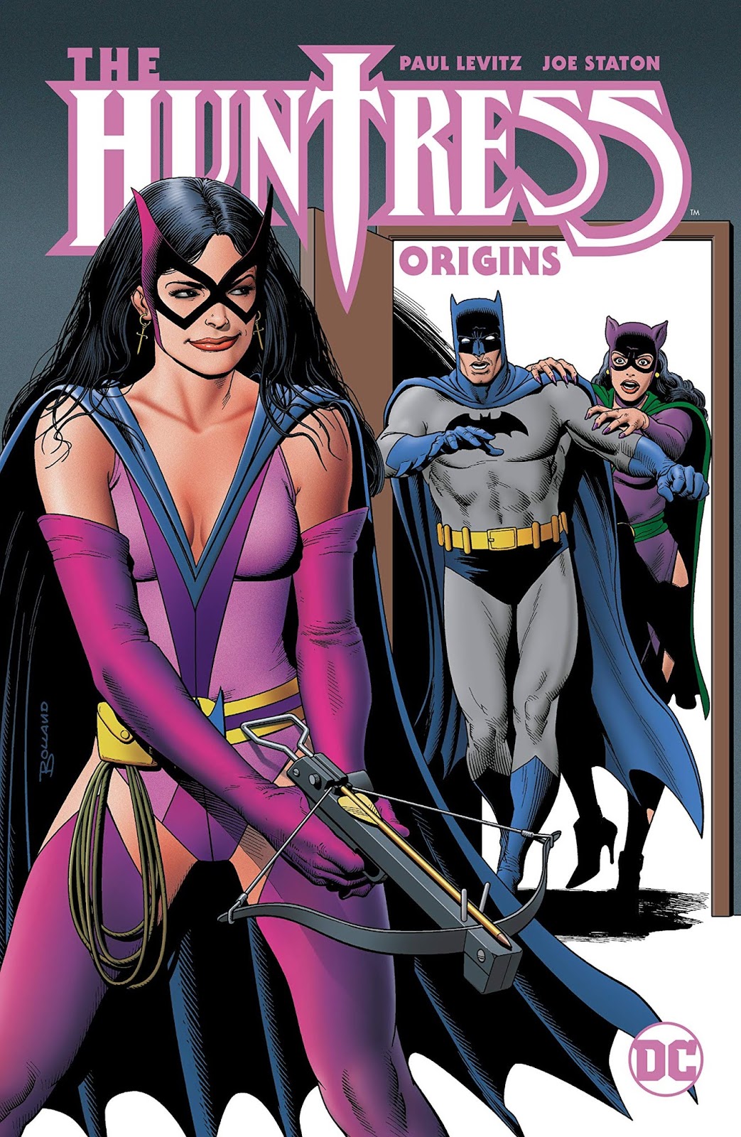
For the new book, DC went with the more modern Huntress logo that's been used for Helena Bertinelli since 1994 and only more recently started being used for Helena Wayne since 2011. The more modern Huntress logo still fits nicely on the top of the cover, but admittedly uses a better colour scheme than the original book from 2006. The Huntress logo itself is a solid white with a lavender stroke, which matches the colour scheme of the overall cover. The 'Origins' subtitle uses the same solid lavender colour as the stroke, which preserves continuity, and the letter arrangement is very well done on the new book.
The spine between the two books is also profoundly different. The original Darknight Daughter book uses a solid black for the spine with the Huntress' face visible on the top, which takes advantage of the use of shadow on the Huntress' face to cleverly bleed into the background. The colours on The Huntress: Darknight Daughter title also perfectly matches the Huntress' costume colour scheme. The Huntress: Origins' spine is a more solid purple with the title itself being white. While the spine is still eye-popping, it's also admittedly less visually interesting than the original Darknight Daughter book.
Lastly, there's the back cover which is perhaps my favourite thing about the new book. In the original Darknight Daughter trade, the back cover is a solid white with black and pink bars and squares patterned throughout, interweaved with panels from the comics featured inside the book. The brief description of the book is also contained in one of the boxes, more specifically a solid white square. The back cover on Darknight Daughter is certainly eye-popping and gets your eye to follow the artwork to the verbiage, but is also a bit 'too noisy' for a back cover.
The Origins book by contrast uses a panel of the Huntress' face (one of my favourite ones at that) on one side of the book with the shape of the iconic dagger from the Huntress logo in the middle, separating it from the verbiage on the right. The right side of the back cover is a solid purple that matches the Huntress' mask, along with a description of the book that's similar to, but slightly different from the one on the original Darknight Daughter trade. The only downside about the text is that it might be too small to read, but is otherwise nicely arranged in a way that flows with the overall design of the back cover.
Between Origins and Darknight Daughter as a whole, I would argue that Origins has a better cover design in terms of use of colour, arrangement, and overall just better continuity in the overall look and feel of the book.
2. Interior Graphic Design

In the original print, the interior graphic design for Darknight Daughter uses a lot of whitespace, which is not unusual for books. Like the back cover, it also uses pink bars and panels from the comic, and for the main title itself it uses different variations of pink and preserves continuity with the rest of the book in that sense. The graphics, panels, and texts are all neatly arranged, but beyond that, there's nothing particularly eye-popping about the interior graphics.
In the Origins book, DC went all out on the interior graphic design and actually put more effort into making it standout. When you first open the book, the first page you see uses a page from one of the comic stories and shades it in purple with 'The Huntress: Origins' title succinctly placed right in the centre of page. The page they used (from Batman Family #18) is well chosen because of the panel layout and because it previews for the reader what they can expect to get from the book, eventually drawing their eyes to the title itself. The placement of the title even makes it feel like a preview for a film.
When you get to the credits page, it follows the same pattern as the introductory page. Whereas in Darknight Daughter, the creative credits were contained on two separate white pages, in Origins, they are placed on a double page spread that has the huntress on one side and the text on the other. It once again previews two pages from the book, again teasing the reader on its contents, and 'The Huntress: Origins' title is placed on the top centre of the double spread, with the dagger of the Huntress logo right in the middle, which is very cleverly done.
When you get to the trade credits, it follows the same pattern as the previous three pages with another page previewed in purple, and the right edge of the page features one half of the Huntress logo dagger which then bleeds into the introduction pages by Paul Levitz done entirely in white. The text on the purple preview pages that precede Levitz' introduction also preserves continuity from the title in that it uses the same font and colour scheme, which also makes them standout. The only downside is that the lavender text on a dark purple background may not be as easy to read in the digital version, but does standout perfectly fine in print.
Between Origins and Darknight Daughter as a whole, the interior graphic design for Origins is a major improvement over Darknight Daughter in that more effort was put into making it standout while keeping the colour scheme consistent with the cover design. Origins even credits the colourist who redid the colours for the trade, which wasn't done on the original Darknight Daughter trade. Only the original colourists from the original comics were credited in the 2006 book.
3. The Print and Paper Quality

As for Origins, it's hard to tell at this point in time if the pages will remain white or oxidise with age. The material is certainly the same as the one DC has been using on all their trades and comics since 2018, and so far, none of those have oxidised with age. I guess we'll find out in five years. I will say that I do have a habit of preserving all my comic trades in air-tight sleeves to preserve their quality, so I may probably have to check back in ten years time instead of five.
I will say the real noticeable difference between the pages of Origins and Darknight Daughter is really in the print style. Since Darknight Daughter is very much a product of its time and was subjected to the printing conventions of its decade, it uses halftone print, which is the style of printing that uses CMYK dot patterns to get the different colours, lights, and shadows on an image. Luckily, because the pre-Crisis comics use flat colours (even in the retouch for the trade), the dot patterns are not nearly as noticeable compared to modern comics which use a lot of lights, shadows, glows, gradients, and light flares to create the illusion of three dimensional space.
At best, with Darknight Daughter, you might notice a grainy texture in the greys and pastel colours, but only if you look really close. From a distance, the dot patterns are not particularly noticeable, at least not to a distracting degree like with modern comics. I would say the print in Darknight Daughter is actually pretty high quality for its time and hasn't shown signs of fading, at least not in my copy.
In Origins, the pages are printed using continuous tone or 'contone' for short. In contrast with halftone which uses a dot pattern to create the illusion of different colours and three dimensional space, as the name suggests, contone follows no particular pattern but a continuous flow of colour. It's also more expensive than halftone, and it's not hard to see why since this style of print produces high quality images, which is ideal for modern comics as it makes the lights, glows, and shadows look smoother and much more pristine than halftone. The latter makes these things look more grainy and jagged edged in modern comics, usually to a distracting degree.
Since the colours in Origins are just as flat as the original Darknight Daughter trade, the only thing that truly makes the print stand out from the latter book is that the higher quality of this print produces more vibrant, solid colours than halftone. Because halftone is limited to only four colours per dot, you lose some of the details in the colour whereas contone preserves them.
On the whole, there's really no significant difference in the overall quality of the paper and print between the two books, but the contone print in Origins does make the colours more sharp and vibrant than the original halftone print of Darknight Daughter. The rest is really a matter of preference.
4. The Bonus Material

The new Origins book does, however, include the original Who's Who page from the 1980s retouched for the trade, but this new retouch is also disappointing compared to the original retouch in Darknight Daughter. Whereas Darknight Daughter did at least correct the typo that was present in the original 1980s Who's Who page, Origins unfortunately kept it, which doesn't make sense to me considering it was already previously corrected.
Another thing that underwhelmed me about Origins is the lack of an updated introduction by Paul Levitz. While the original from 2006 is still informative in detailing the history of the Huntress, by not updating it, the introduction doesn't mention other appearances Helena Wayne has had since 2006. Namely her appearances in Geoff Johns' run in Justice Society of America in 2008 (which is one of the more critically acclaimed runs), and her appearances in the New 52. While I have gone on record saying that the New 52 is not one of my favourite eras for Helena Wayne, other younger readers may still want to know about those appearances.
Another thing I would have loved to have gotten is the textless version of the Brian Bolland cover as a bonus feature, as well as the covers of some of the comics the Huntress appeared in pre-Crisis like All-Star Comics and Adventure Comics.
Lastly, the #1 thing I lament about the Origins book, however, is DC choosing not to feature her meeting the Earth-1 Batman for the first time in Batman Family #17, as well as her team-up with Batgirl and Batwoman from that same issue as a bonus story. I would've also loved to have gotten her holiday story with the Earth-1 Batman in Brave in the Bold #184 as a bonus story as well.
5. Final Verdict

The introduction by Paul Levitz is still insightful for understanding how the Huntress was originally created as Helena Wayne and later rebooted as Helena Bertinelli. I just wish we had a more updated version of this introduction to include mention of her later appearances in comics in the past two decades.
As a book, it's definitely a high quality product. It definitely holds its own against the original Darknight Daughter trade, and even does some things better than the original Darknight Daughter trade. The graphic design in Origins is definitely superior to the one in Darknight Daughter in my opinion, but the original Darknight Daughter trade still did the Who's Who retouch better.
Four out of Five, I definitely highly recommend getting Huntress: Origins if you don't already own a copy of Huntress: Darknight Daughter. Or if you do already own the latter, and you want to enjoy the better graphics and high quality print that Origins offers, you can certainly do that as well.
★★★★☆
Did you enjoy reading this article? Consider supporting me on Patreon where you can get early access to upcoming posts and exclusive content that won't be posted anywhere else!
While I agree with you that it would have been nice to get some of the stories you suggest (from BATMAN FAMILY #17 and THE BRAVE AND THE BOLD #184), the fact that they were written by writers other than Paul Levitz (Gerry Conway and Mike W. Barr, I believe) actually make them a better fit for a second HUNTRESS volume that would also include the remaining Helena Wayne Huntress stories from the pages of WONDER WOMAN, the ones also not written by Levitz. If only DC would just take my money . . .. Lol
ReplyDelete